Scheduler Update
Sole Product Designer • Push Operations • March – May 2024
Overview
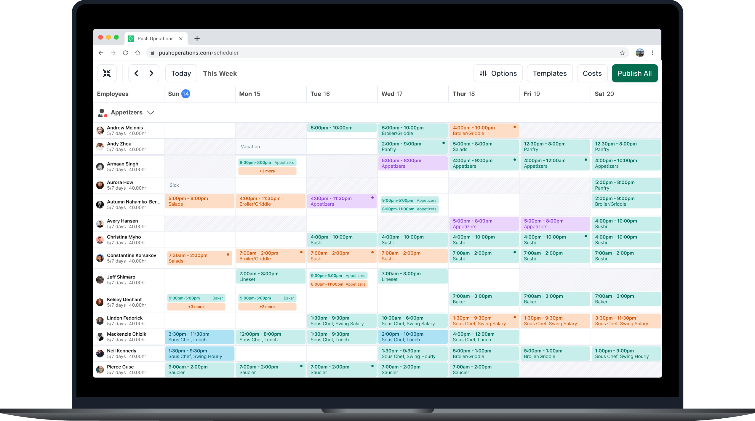
Redesigned the weekly schedule view — one of the most heavily used parts of the platform — to dramatically improve density, clarity, and usability for real-world restaurant managers.
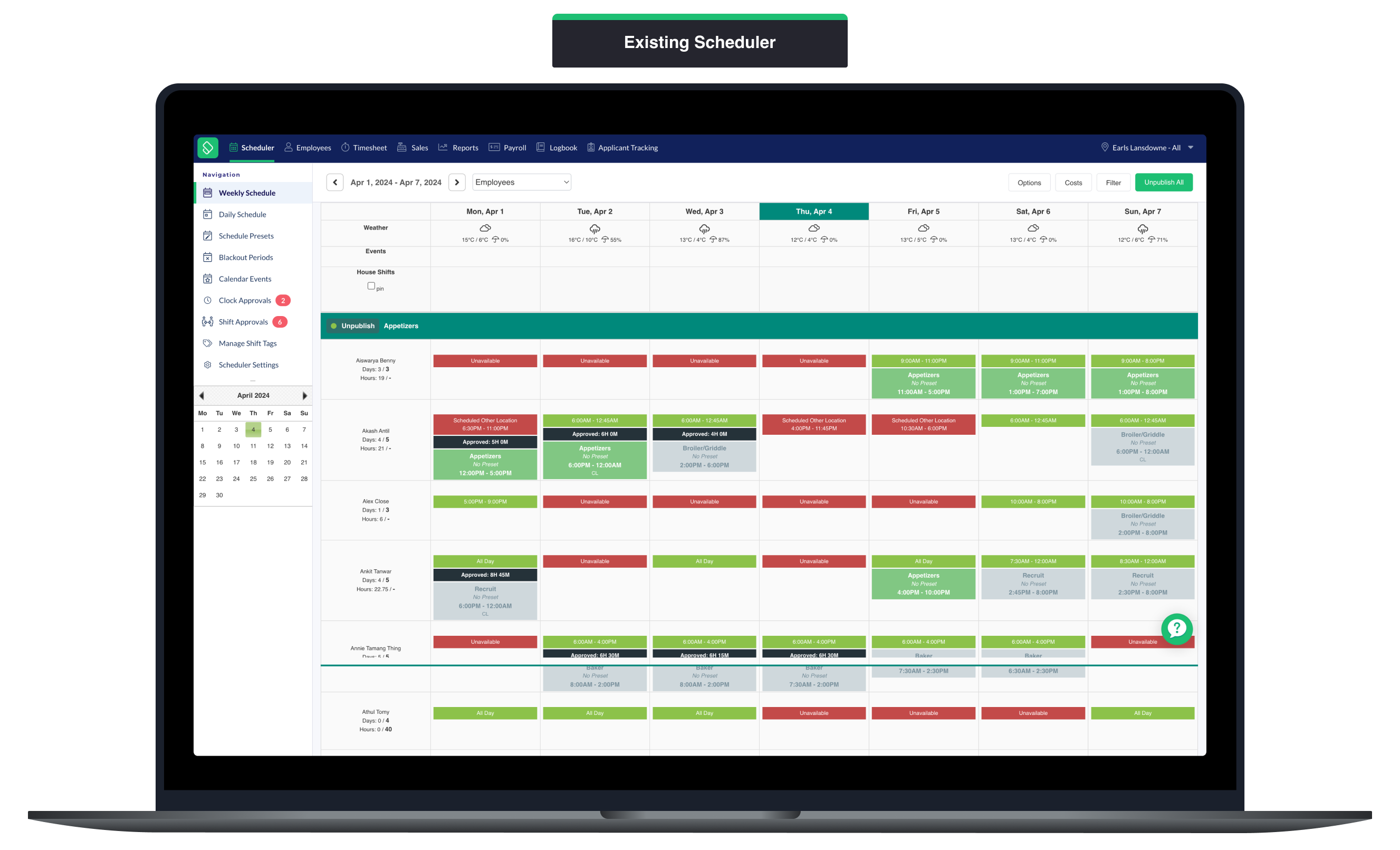
Many of our users — including large brands like Earls, Tim Hortons, and A&W — rely on our scheduling tool every single day. But we kept hearing the same thing: the scheduler feels cramped.
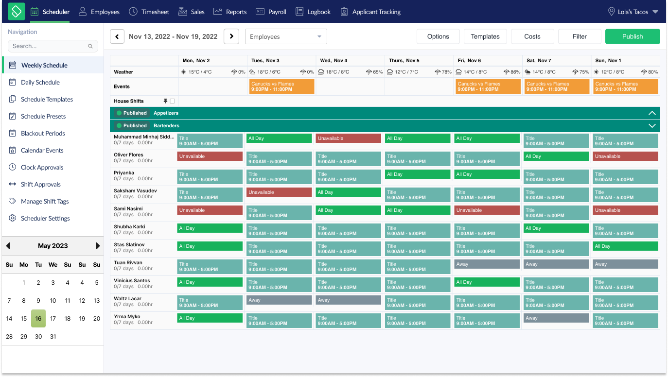
On a typical restaurant computer screen, only 5–7 employees were visible at once, making it nearly impossible to manage conflict resolution, availability, and shift compliance at a glance. The feature had grown messy and inconsistent over time, with patchwork UI that hadn't kept up with user needs.
I was tasked with a full redesign of the weekly scheduler view to solve this issue. The goal was to significantly increase screen density without sacrificing legibility, modernize the interface, and improve scheduling accuracy — all within the constraints of an aging codebase and a small dev team.
Problem
The old scheduler layout only showed a handful of employees at once, leading to inaccurate scheduling decisions, poor visibility into conflicts, coverage, and compliance, and frustrated users who felt the tool was inefficient. "As a schedule maker, I want to see more of my employees' schedules on screen so that I can make informed decisions around conflicts and availabilities." Our users needed to see 20+ employees at once — not 6.
Goals
- •Significantly increase screen density without sacrificing legibility
- •Modernize the interface for better usability
- •Minimize disruption for existing users
Constraints
- •Aging codebase with technical limitations
- •Small development team (3 engineers)
- •High-usage feature requiring careful changes
- •Need to support lower-resolution screens (1366px and 1920px common widths)
Process
Research & Discovery
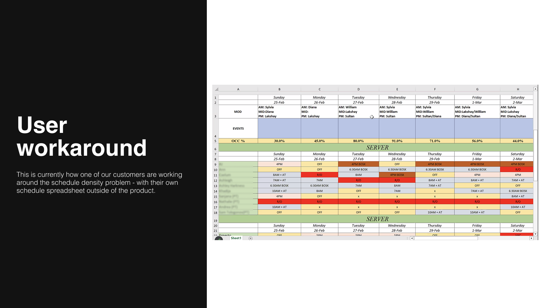
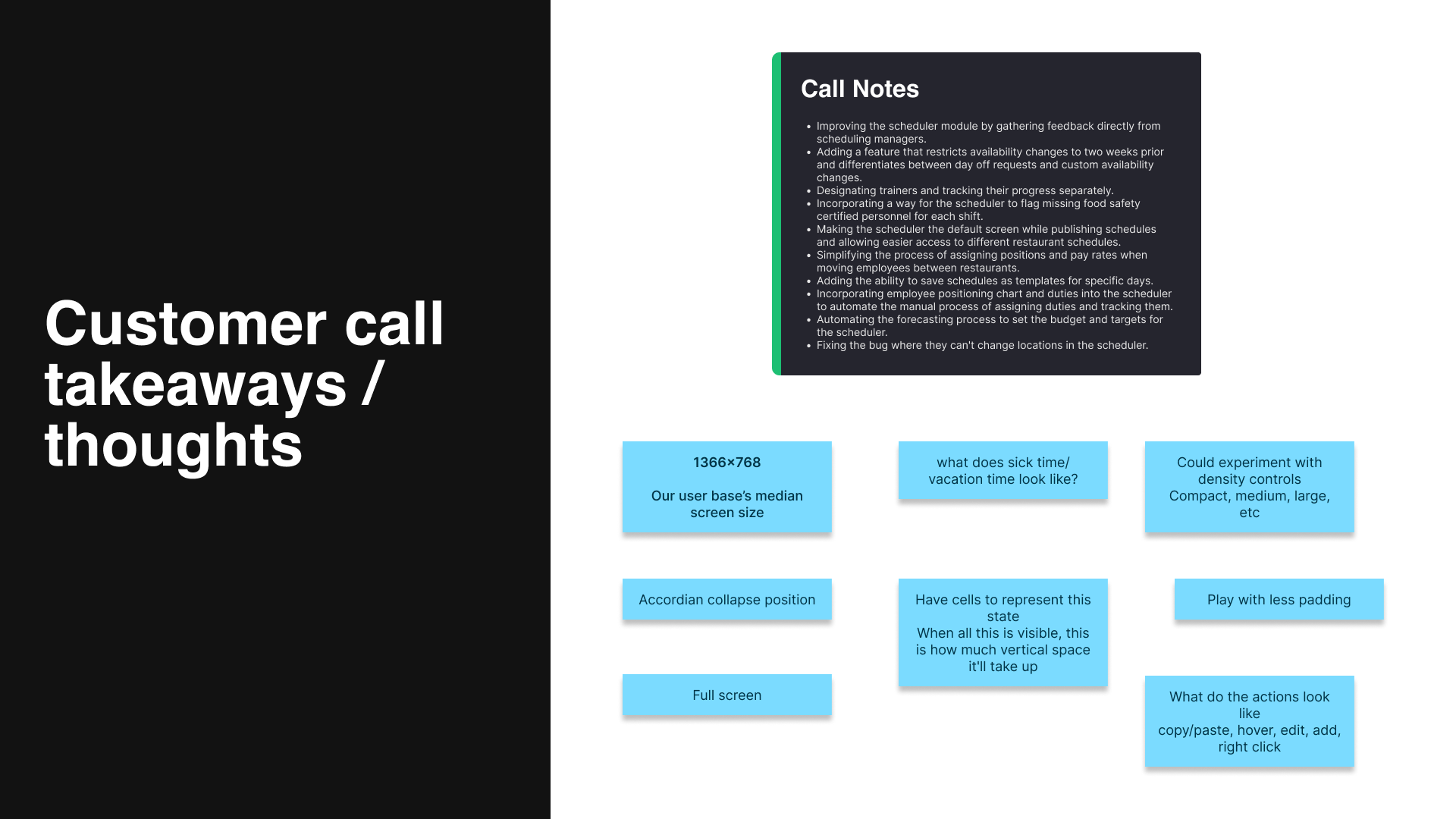
I started by reviewing insights from Productboard and support feedback, conducted interviews with restaurant managers and operators, and audited dozens of real customer schedules to better understand screen density and device limitations. During those calls, I uncovered something interesting — one of our clients was actually bypassing our scheduler entirely in favor of their own custom spreadsheet system. Regrettably, someone on their team still had to manually transfer everything back into our product for consistency and visibility. It was a clunky workaround, but it offered valuable insight into how some clients were building their “ideal” schedules. That client generously shared a screenshot of their spreadsheet, which ended up heavily informing the direction of our redesign.
Prototyping & Iteration
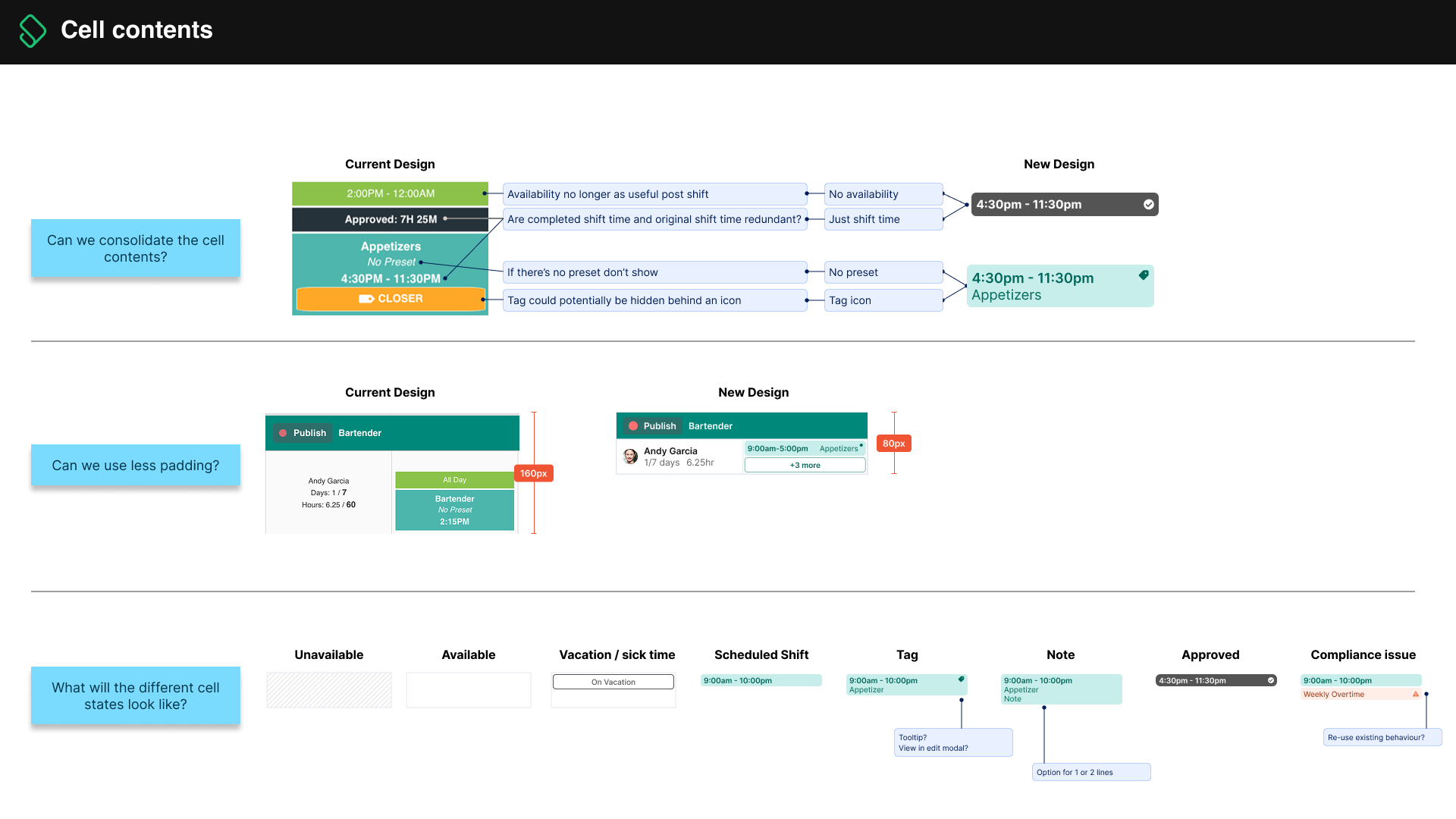
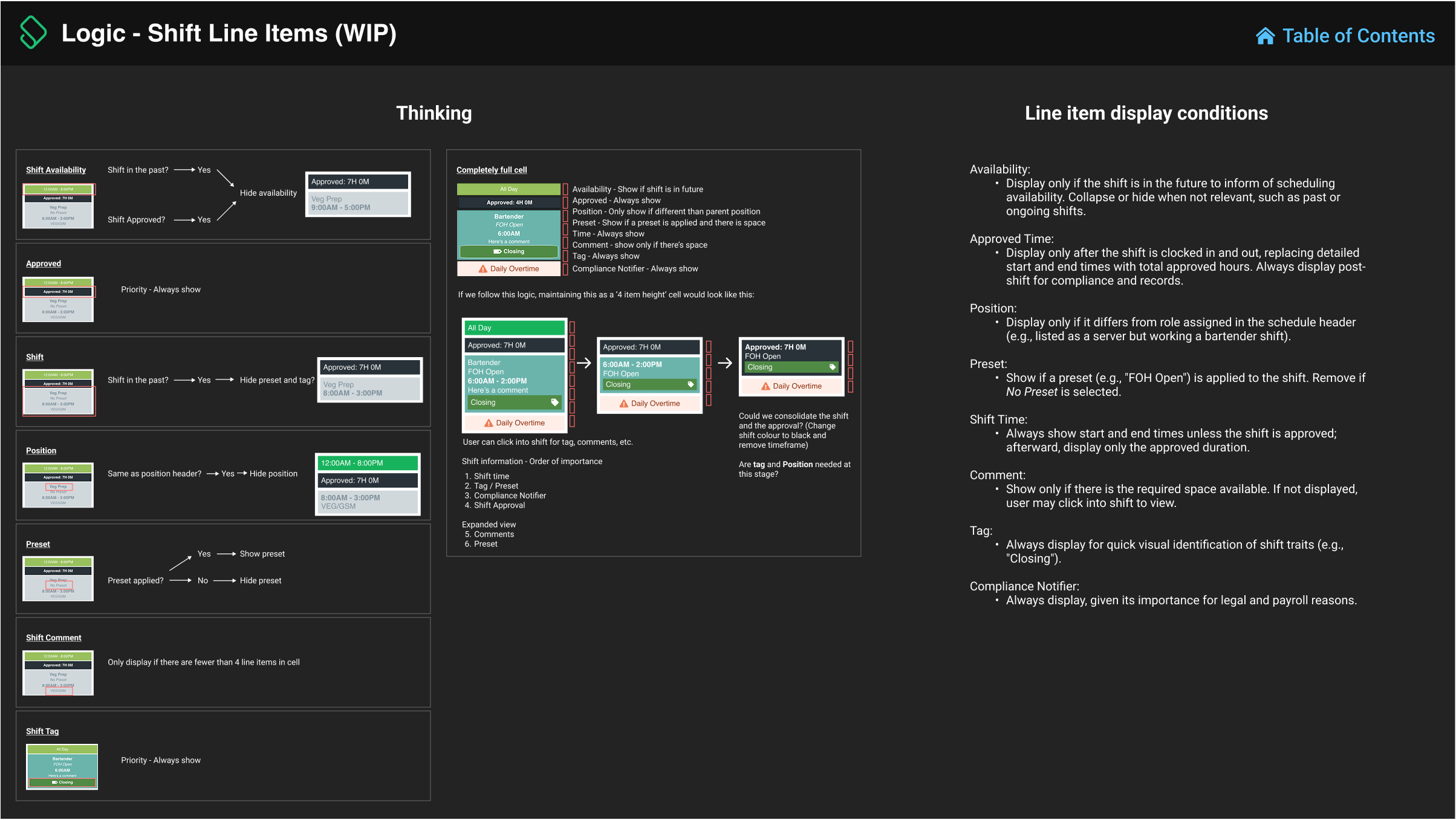
I started with greyscale lo-fi prototypes to explore new layout approaches, and ran both internal and customer reviews throughout the design phase. I iterated quickly to find the right balance between density, usability, and scope — all while designing with common lower-resolution screens in mind (1366px and 1920px widths). I also audited our existing schedule components — specifically the shift cells — to figure out exactly what information needed to be shown, how we could lay it out more effectively to reduce visual noise, and how much space we could save at the pixel level.
Componentization & Standardization
I established consistent visual hierarchy for shift cells, headers, and cost rows, introduced a hover interaction pattern for lightweight editing and quick visibility, added collapsible rows and position headers to let users focus only on relevant employees, and leveraged a previously built sidebar component to reduce vertical scrolling and allow in-context view settings.

Challenges & Solutions
We faced several challenges during the project. The aging codebase made new layouts difficult to implement, so I worked closely with engineers to prioritize changes that brought clarity without requiring major refactoring. This was one of the most heavily used parts of our product, so even small UI changes could disrupt workflows. I designed carefully, conducted many reviews, and considered adding a 'legacy mode' toggle before settling on a version that modernized without making any massive functional changes. I also created a full 'scheduler refresh' UI concept, but the team didn't have capacity to build it — so I distilled the best parts into the final design.
Future States
As mentioned, I designed a full reimagining of the scheduler — a minimal, full-screen interface that utilizes a more modern drag-and-drop flow. Inspired by best-in-class scheduling tools and dozens of dribbble posts, this version showcases what our platform could become. While out of scope for this phase, the concept has become a rallying point across product and leadership teams - and is often brought up in all-hands meetings, to my delight.
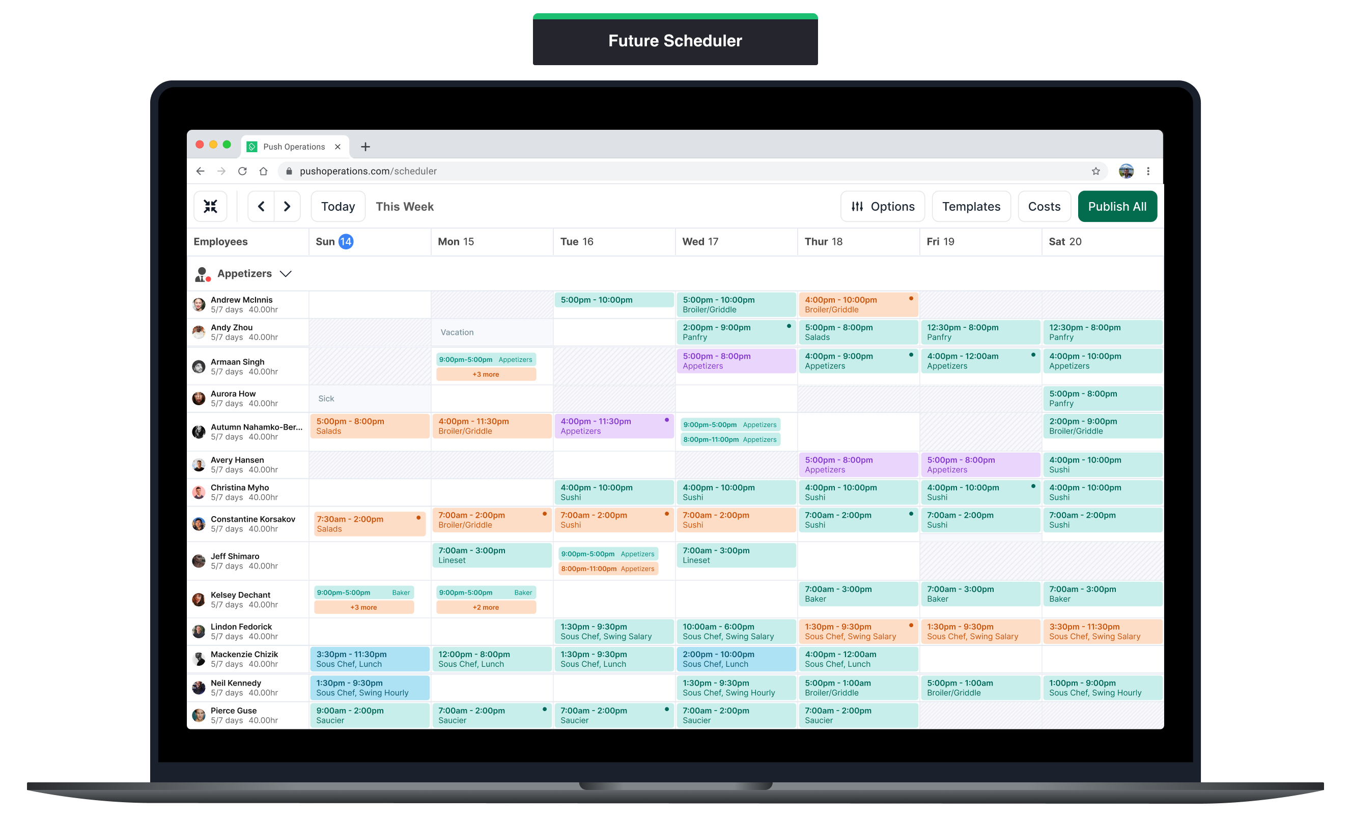
Solution
The new scheduler shipped with major improvements, including:
Visual Hierarchy Overhaul
Cleaner, denser layout showing significantly more employees and shifts per screen
Shift Cell Redesign
Condensed data display, improved color contrast for accessibility, and logic rules for what's shown
Sidebar Optimization
Contextual filters and settings now live in a collapsible sidebar, saving space and reducing clicks
Collapsible Rows & Position Headers
Users can now hide irrelevant roles (e.g., kitchen vs. FOH) while scheduling
Cost Row & Weather Row UI Refinements
Tightened layout for these essential planning tools
Results
- •Dramatic increase in on-screen density with side-by-side comparisons clearly showing 2–3× more usable information per screen
- •Positive feedback from high-volume clients with early access customers embracing the new version without complaints or confusion
- •Team-wide excitement for future vision with my 'inspirational' full-screen scheduler design celebrated internally and used as a visual North Star in company meetings
Reflection
I gained a deep understanding of how frontline managers build and interact with schedules, navigated legacy code constraints, and improved my skill in balancing vision with scope, and in building solutions that enhance the product without alienating loyal users.